Simplecast Essentials
Independent Podcasters
Related articles:
Podcasting, as we’ve all heard, is one of the most inclusive, welcoming mediums–except when it isn’t. It’s true that the relative barrier to entry is pretty low, and that the community is extremely warm and generous–but that doesn’t mean we’re serving every podcast creator and listener as well as we should be. There are plenty of apps and services out there that are, frankly, simply unusable by people with disabilities. On our end, we’re committed to fixing it. (And since it’s the Global Accessibility Awareness Day, it’s only fitting that today is when we tell you about it.)
Amy Marco, one of Simplecast’s incredible product managers, has been leading our accessibility efforts. “One of our core values is that our products and services should be available and accessible to everyone. Sadly, most podcast players aren’t designed to be accessible to people with disabilities, and, because of this, there are a lot of people out there who are completely unable to enjoy podcasts. We wanted to take the lead in making audio more inclusive, and something everyone can enjoy.”
Here’s what our roadmap looks like: today our Standard and Mini players are fully accessible. We’re in the process of making our Show player and our podcast creators’ individual podcast websites accessible as well. We’re also working towards making our website and dashboard fully optimized for accessibility. That way, any creator can use Simplecast to distribute their show across the podcasting landscape, learn about their audience, and grow their footprint.
In the meantime, we’re offering webinars and blog posts to our creators addressing best practices for making their shows accessible to the widest audience possible–whether that’s using alt text on the social images they share to promote their show, making sure their transcripts aren’t paywalled, or something else.
So what have we done so far? On our Standard and Mini players we have:
- Increased size and boldness of the ‘Close’ button on the share & subscribe drawer to help people find it.
- Updated contrast on buttons to help people see what they are. Previously these had a much lower contrast unless you were hovering over them, so viewers didn’t always understand that there were buttons to be found–especially those with vision issues.
- Given all buttons and links accurate and easy-to-understand labels so that screen readers can be easily used.
- Given voiceover labels on buttons and links accurate and easy to understand names so that people who use voiceover technology can find and easily understand them.
- Reviewed multiple browsers to ensure our contrast is similarly sufficient. Internet Explorer and Safari were reported to have different contrast than in Chrome.
We’re committed to being transparent in this process–if you’ve got questions as a podcast listener, creator, or even another podcast hosting company, we’re happy to share what we’ve done and what we’re doing to further these efforts. Accessibility shouldn’t be a selling point, or a competitive advantage, which is why we’re open about our plan.
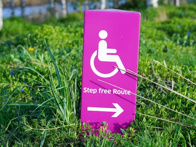
The fact is, the elements of good design dovetail with making sure our players are accessible–it’s just a matter of acknowledging the wide variety of people who listen to podcasts, and prioritizing the ones who aren’t being served as well as they can be. As Belo Cipriani, our accessibility consultant from Oleb Media, says “Good design is inclusive and does not just design for the dominant population. For example, everyone uses ramps – not just people in wheelchairs. Research shows that universal design does not just improve the experience for people with disabilities, but for everyone else as well.”
Accessibility isn’t a feature, nor is it a privilege–it’s a right. And that’s why we want to make it right.