
Podcasts, an audio-based medium, are a vehicle for any number of carefully concocted stories be it fiction or non-fiction that has become one of the more popular ways for anyone to indulge in their creative freedom. After all, podcasts don’t have the financial needs of video games, films, or stage plays, where things like graphics, costuming, lighting, and really bad hair would usually be a distraction. This leaves the area of critique for audio based entertainment to be a bit sparse, but only at first glance. To assess sound is to assess the very nature of speech and now aspects such as equipment quality, voice acting, audio mixing and engineering and whether people remembered to turn the AC off or lock their cat out of the bedroom are one of many things to consider in the realm of the average podcast editorial. An audio drama, for instance, will also be assessed by their story, their characters, their world building, and narrative stakes that must all be conveyed through sound.
Podcasts are an experience that can be enjoyed without visual aid, but it does make me wonder if the things we can see with our actual eyes and touch with our actual hands hold critical merit after all. In fact, maybe a tasteful photograph or creative artwork enhances my experience of sound all together.
“Podcast art matters more than most people realize,” says self-taught UX designer, Asher Silverman. “You're not supposed to judge a book by its cover, but the cover is the first thing you see, and it's often a deciding factor in whether or not you decide to give it a try. Podcast art is exactly the same.”
There’s something to be admired in the uncanny, the uncomfortable, the avant-garde that indie spaces especially flourish in.
Talking about the cover art when it comes to discussing any piece of fiction not only seems shallow but comes across as an amateurish, juvenile reaction to what could possibly be something so much more complex than that. As Silverman points out, “don’t judge a book by its cover” is an old idiom meant to dissuade harsh judgments of our fellow man based on outward appearance alone, but this idea can influence us in more ways than one.
Passing judgment on literature, movies, television, songs, or podcasts purely on a visual level is the first step to a doomed, monotonous experience both socially and artistically. And as a critic, I care about far more important things than color palettes and typefaces when writing styles and acting skills are more easily overlooked. But also, as a critic, I’d be lying if I said the image I clicked on to even discover these elements about a creative work didn’t have any significance.
First Impressions: What’s The Value in a First Look?
What’s the most interesting cover you’ve seen in the last few days?
It can be from anything: an album, a DVD, a video game, the thumbnail to a YouTube video–just as long as it’s something that’s stuck in your memory for one reason or the other. Never mind if you actually watched, listened to, or read the product attached to it, just as long as you’re aware of the image that caught your attention in the first place. You may not have even internalized the title, and certainly not the creator, but if you did see it again, you would just know this object left some sort of impression, no matter how fleeting.
When I think about cover art, I always recall when I would go to Virgin Records in my Inland Empire hometown and how I would always pass by this wall section completely covered in CDs they had for sale. Before you made your decision, you could listen to demos of those CDs, your potential purchase of choice entirely based on what covers caught your attention first.
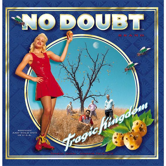
I may have been a little girl who got all of her musical needs satisfied by Hillary Duff and The Slumber Party Girls, killing time while my parents window shopped, but there’s probably a reason why the image of a woman in a white tank top and panties concealing a knife behind her back from She Wants Revenge’s debut album or Gwen Stefani during her ska-era wearing a liquorice red dress next to a desolate field had me listening to the song demos with this old, ancient device we called “wired headphones”.
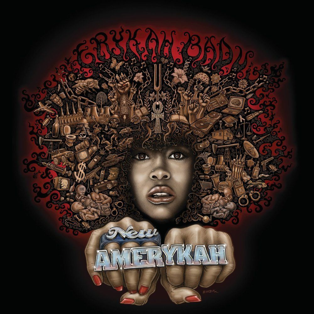
Or why, even though I haven’t physically touched my mother’s collection of jazz and R&B in years, I can remember the dizzying afrocentric surrealism of Eryka Badu’s New Amerykah Part One (4th World War). Or how I attributed such emotional value to small plastic women simply because they were pretty with nice clothes and brushable hair.
A cover on anything is the visual equivalent of a “hey look!” and that “hey look!” quality can make or break the chances of it taking off. The power of a strong, visual presence teasing the arrival of the next big podcast debut can rally up excitement, especially if there’s just enough good word of mouth between listeners--never underestimate the power of simply creating intrigue. This also applies to podcasts that hope to make extra money by selling merchandise. Much to my own chagrin, we haven’t quite developed the technology to repackage podcasts as trendy, hipster relics, but online store trinkets are all the rage these days.
If a future fan's impression of a new, hip audio drama (or, fiction podcast) is that the cover would look really cool on a t-shirt, coffee mug, or sticker you so gracefully printed off Redbubble and they want the street cred of actually knowing what it represents, it’s safe to consider that progress. Stellar images do not always translate to quality of content and vice versa, but the fact that you convinced someone into thinking the two are correlated isn’t always a bad place to start. The next step is proving their suspicion correct.
Art Outside of the Box Art: Why Have One Image When You Could Have a Gallery?
I honestly think not enough audio dramas invest in having a variety of images instead of just one, which is a shame because it can really get people immersed if there’s some sort of visual medium to attribute it to. Maybe it’s breaking a rule somewhere to have any sort of environmental or character art in something that’s purely audio because it muddies the chances fans have to interpret it freely, but I personally think it makes for great additional content and can set the vibe before anyone even listens to an episode.
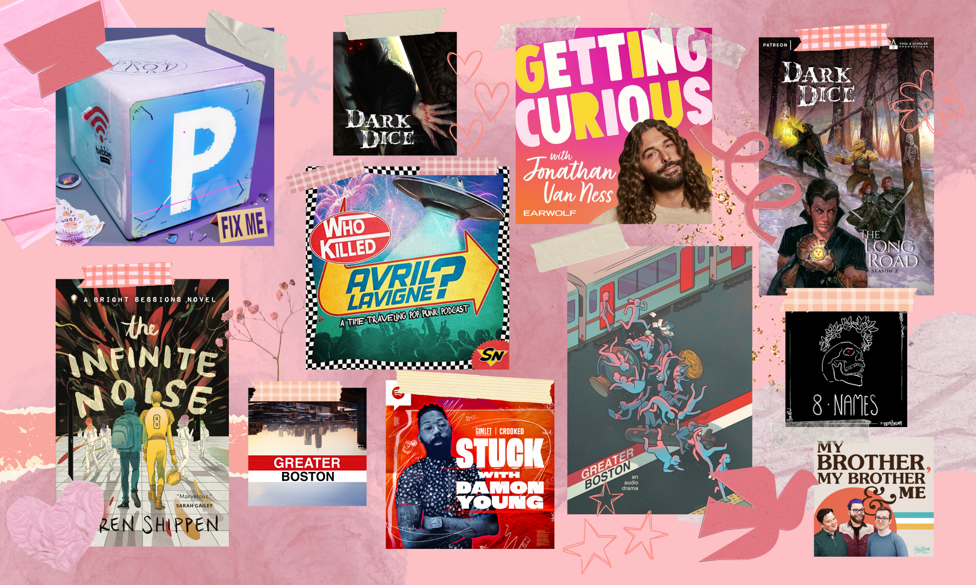
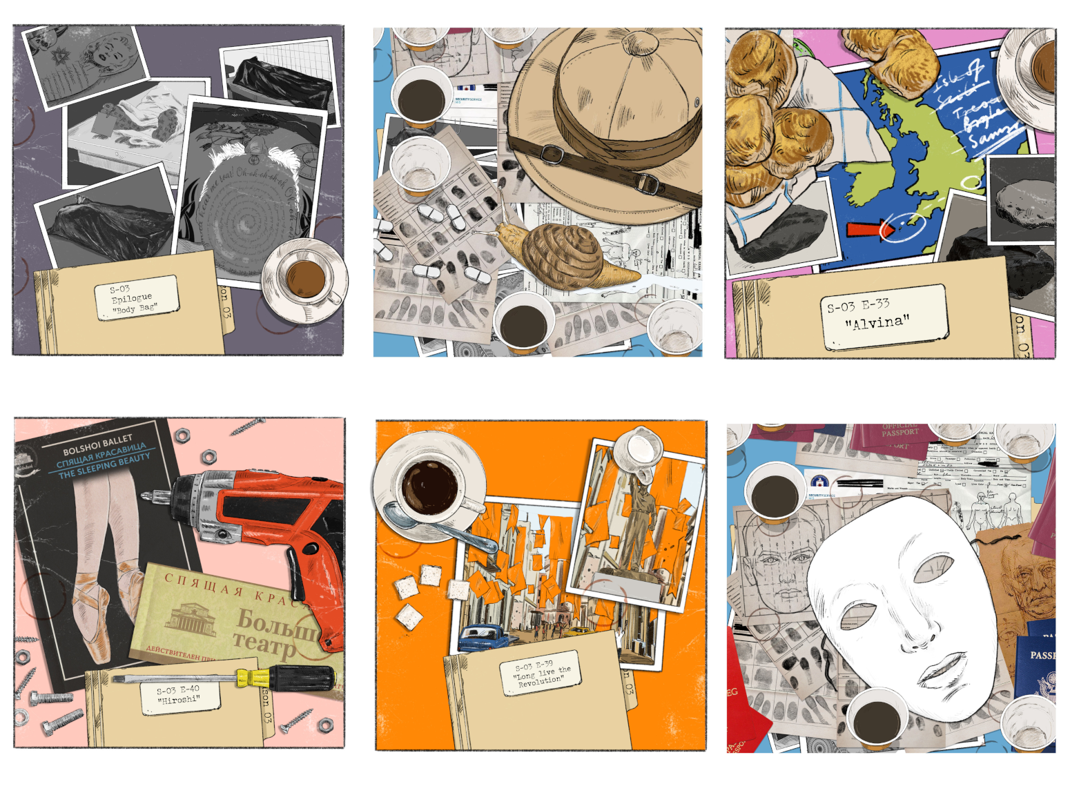
For example, The Amelia Project has these gorgeous, digitally drawn images of desk clutter that contain subtle references to the episodes, on a background of neat white squares as if you were seeing vintage postcards. The line art is pencil thin, the colors are a comforting blend of pale and warm tones, and the whole thing manages to convey chaos under the ruse of classiness that the show’s premise relies on.
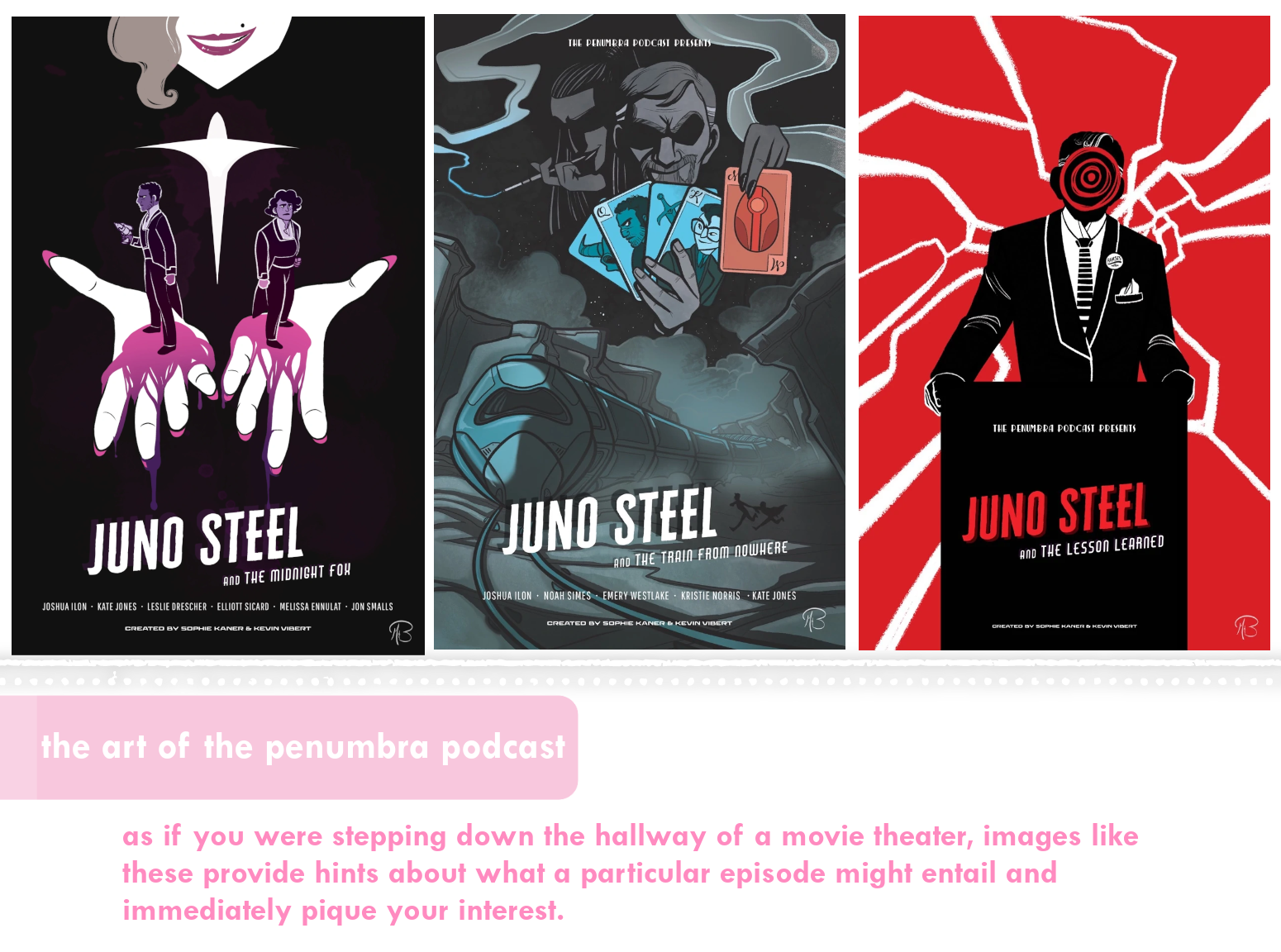
The Penumbra Podcast has had artist Mikaela Buckley draw these gorgeous noir-style movie posters washed over in midnight blues and moody purples.
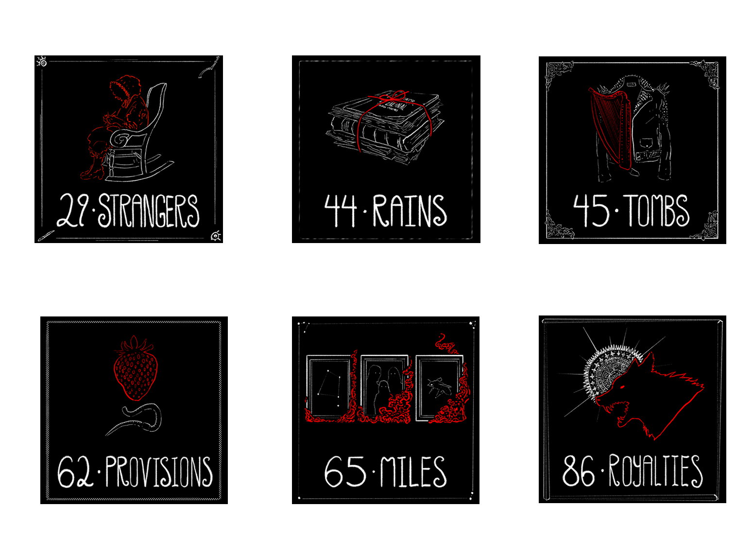
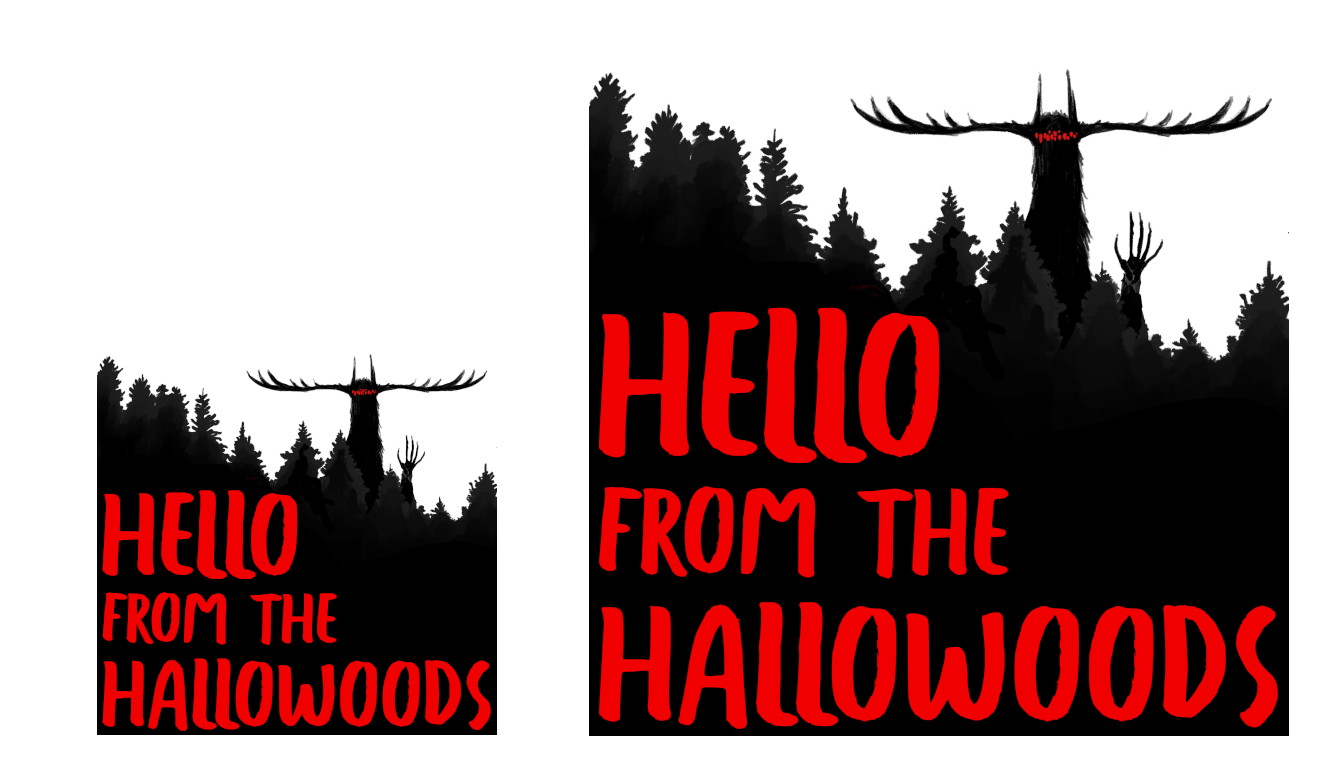
Horror series Hello From The Hallowoods has these black-and-white illustrations for each of their episodes which contrast nicely against a splash of red that becomes the image’s focal point.
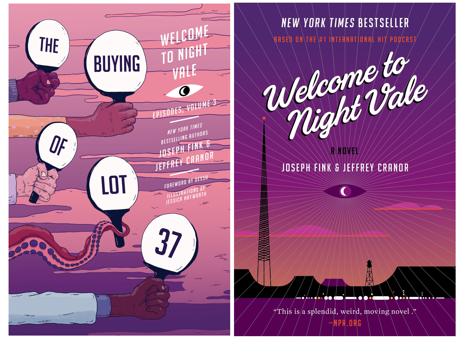
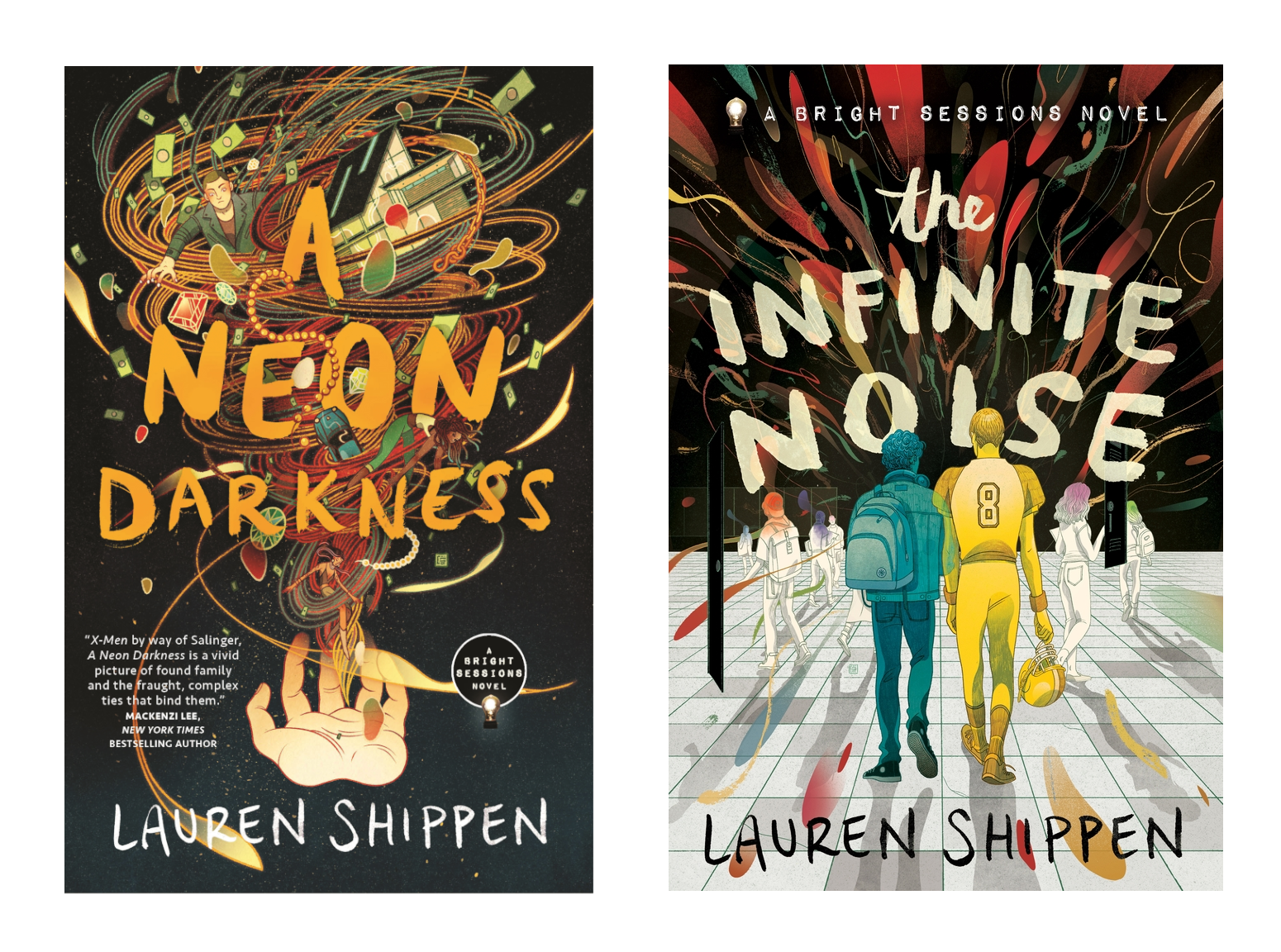
Welcome to Night Vale has become synonymous with an ominous purple sky and eye imagery, with its books carrying on the tradition of its simple but surreal art. And the books for The Bright Sessions can be identified by their contrast of earthy colors layered over muted tones, and a strong use of perspective that mirrors the modern-collage, lightbulb art of the podcast they’re based on.
If you are just going to stick to one single image, you may as well make it count:
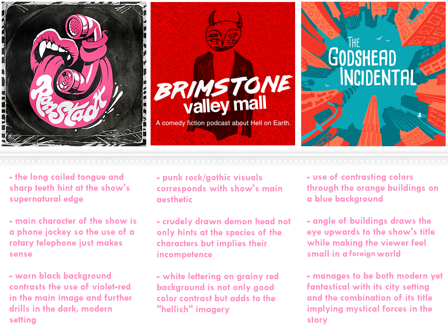
Supernatural noir comedy Ronstadt has this long tongue curling around a rotary telephone that just screams punk rock. Eerie Dungeons & Dragons Dark Dice’s bloody, looming hand creeping out of a doorway hints at its grimdark fantasy atmosphere. And dark comedy Brimstone Valley Mall lets you know what it’s all about with their early 2000’s Hot Topic-reminiscent image of a crudely drawn demon head photoshopped over a leather jacket. The upward shot of a city on a blue and orange color palette really sold me on The Godshead Incidental and there’s just something very all-encompassing and surreal of Greater Boston’s titular city dangling from the sky. If you only have a thousand words to spare for your pictures, let that one single picture be the best possible one you can make.
Clichés Like Clockwork: Avoiding Art Pitfalls
The pursuit to be immediately understood with blatant simplicity can often hinder the more unique qualities of a well-rounded audio drama experience. The line between minimalism and hastiness is a thin one and most podcast cover art definitely resides in the “less is more” school of thought. Not to say that a little text and a single photo has stopped podcasts from getting especially popular, though it was certainly an uphill climb to get there.
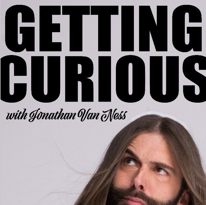
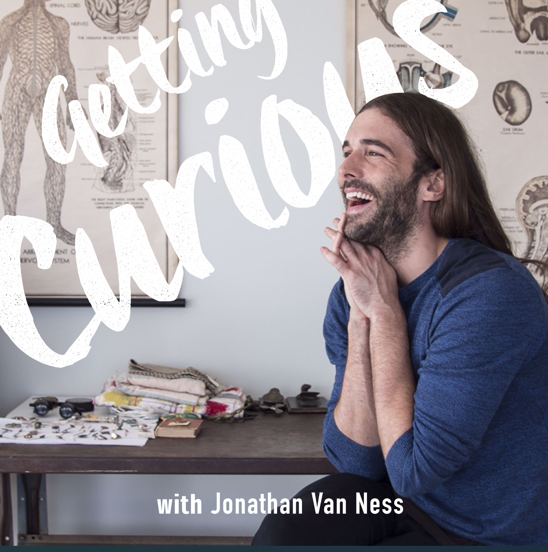
Take, for example, shows like InfoWars and My Brother, My Brother, and Me where the core cast is the entire point, even specifically mentioned in the title for the shows Stuck With Damon Young or Getting Curious with Jonathan Van Ness. But these are more akin to highly charisma driven (and occasionally morally questionable or glaringly incorrect) talk shows while audio dramas don’t generally have celebrities, political figureheads, or internet cult conspiracy theorists in the same way that films and TV shows do.

This is changing in some respects–I’ve even reviewed shows with some very established actors–but still, the cultural environment for audio drama is drastically different. With audio drama, and especially the more independent work, you can’t typically sell your show on names alone. If you managed to snag Night Vale’s Jeffery Cranor or Lauren Shippen from Atypical Artists for an episode, that’s going in the press release or the inevitable tweet to spread the word. It will definitely make for a meaty episode description, but to dedicate the entirety of the cover art to it? Well, that’s just not classy (or accurate).
This article has mostly aimed to analyze art for fiction podcasts, but all of these observations are also important for non-fiction podcasting, though many applications or procedures are different. No matter the topic, good cover art needs to sell an idea when actors and descriptions can’t. “The biggest common mistake I see is creating podcast covers that don't tell you anything about the show other than the title,” says Silverman. “You're trying to convey what the show is like as a whole, and the title isn't necessarily representative of that.”
There’s something to be admired in the uncanny, the uncomfortable, the avant-garde that indie spaces especially flourish in. This kind of artistic freedom has inspired a slew of audio drama covers that are not only representative of their story but eye-catching pieces of original art. There is a place for simplicity, but letting the title do all the talking for you will fail to properly express your story.
Group Portrait: Why the Best Art Comes From Collaboration
Being able to cut out the necessary fluff and filler that comes with making movies and television shows is part of what makes podcast production so appealing to the average person, but I also think that’s what can inspire a lack of confidence in more ambitious cover art. Imagine hypotheticals: how would this look as a poster, a CD cover, a phone wallpaper or tattoo? If your characters were made into Good Smile quality figurines, would they be adorning the shelves of self-appointed collectors?
“It should look good both small and large,” said Silverman “Most listeners are going to see it shrunk down more often than not. It needs to be both recognizable and readable at that smaller size.”
And if these types of questions feel too foreign to you, there’s absolutely no problem seeking out someone with the right expertise. Hire someone to do the cover art for you or a graphic designer for your show as a whole. Technically anyone can slap some photos together and call it a day the same way anyone can make a song or anyone can dance, but there’s a select few that are fluent in more complicated software or have an art degree they’re dying to put to use. Someone who understands the language of design can do the more complex work of making custom fonts, visualizing worlds and characters, and crafting completely unique assets attached to your story alone.
Leaving the right work in the hands of people who know exactly what they're doing leaves less room for error and a better chance for a bigger, stronger outreach. Possibly the one thing worse than no cover art is cover art that doesn’t leave a good impression, which can make the show seem bad by proxy. Podcasts with in-house artists not only guarantee them a more consistent visual aesthetic, but provide an aid in boosting their social media presence. Not everyone will click your Spotify link, but they’re more likely to share the lovingly-crafted illustration connected to that link.
Novice graphic designers who aren’t particularly tech savvy will learn it's weirdly easy to make similar mistakes in different ways: low quality JPGs, awkward cropping, generic or unreadable fonts, or just poorly proportioned or colored art in general–graphic design is not everyone’s passion, or skill. You wouldn’t want the first impression anyone will get of your show to be something that looks hastily drawn, severely lacking perspective, or scratchy line art that positively reeks of a rushed product. I’ve seen covers that are amateurish at best and downright ugly at their worst to the point I had to convince myself it was a deliberate, childlike innocence evocative of the show. Not that I cared to listen to it, because I had already been put off the idea.
I taught myself how to do graphic design on GIMP back in middle school because I wanted to have a cool-looking profile on MyAnimeList (which is such a painfully early 2010’s statement) and though I can’t say it’s made me an expert, it has given a keen eye for the common trappings of beginner graphic design.
I’ve seen covers overuse filters in place of a consistent lighting source, only further highlighting the low quality of the center image–implying that it was in center to begin with. No one should be able to tell which PNG came from which website or what words you typed into Google Images for your background. Immediately recognizable typefaces can be uninspired and much less innovative than hand-creating your own title.
There’s also the crime of overusing design templates that I see most frequently for “missing person” podcasts and the true crime scene, causing many of them to be lost in the sea of other similar crime investigation-style shows. True crime podcasts have fallen victim to grayscale backgrounds, sights of giant, lumbering woods or empty roads, and the especially popular trickling blood effect. This doesn’t make them inherently bad covers, just interchangeable ones.
When I asked Silverman about their least favorite podcast cover design trope, they confessed to it being microphones. “I'd love to stop the over-utilization of microphones…It tells you nothing about what you're about to hear and at worst it's a signal that a show doesn't know what it's about beyond ‘it's a podcast’.”
A seasoned artist or graphic designer knows to avoid these, but someone who invested all their knowledge into giving a solid vocal performance or composing music like no one has ever heard will completely miss them. In pursuing art, it’s valuable to have an understanding of a variety of artistic languages rather than just one, and if not, the ability to appreciate and acknowledge the skills we lack. Some of the best podcasts are collaborative projects and having someone on staff who can handle the visual aspect while someone else handles the audio lets people flourish in their fields.
The Importance of Presentation (a.k.a. Everyone’s a Little Bit Shallow)
In preparation for this article, I ended up doing my fair share of research. I’ve been reading up on Aesthetic Archives on Crack Magazine as a fuel of inspiration, watched videos about video game cover art, wondered what preferences fuel my desire to watch certain movies, listen to certain artists, read certain books and whether they fit into any sort of specific artistic niche I enjoyed.
While exploring Spotify for references, it definitely had me thinking critically about even the shows I loved and if there were some recurring design trends in my own favorite audio drama. It turns out there was little to no overlap.
I love the look of the dingy, barely functioning logo for PodCube™ as well as the show’s offbeat comedy. I haven’t even been able to give Midnight Disease’s The Star Collector a proper look yet but it sits in my subscriptions feed longer than most because that visual of alien foliage spilling out of a glass enclosure is something I just have to know more about. Super Normal Media’s Who Killed Avril Lavigne? is a triple threat with its title, retro visuals, and an amazing show attached to it all.
There is no one way to make impactful art and that’s just the beauty that comes in the variety of the genre. I do stand my ground on the importance of understanding art in order to pursue it, which is exactly why I feel things like patience and vision are far more essential than knowing how to navigate Adobe Illustrator.
Am I saying that all those pursuing a career or even a passing hobby in entertainment must study up on the importance of color theory, visual aesthetics, and design? Not exactly, but it definitely helps. Even just understanding why you like the art you like will help you figure out your visual wants and needs for your podcast. Creating a podcast comes with some crucial secondary responsibilities: a personal website, social media outreach, teasers, and some strong visuals to keep it all together is just part of them.
Podcake is a pseudonym for a podcast critic who has been working in audio analysis and reviews since 2015 on Tumblr, where only the strongest critics could forge their analytical muscles. Her specialty is fiction podcasts, though she also has a large repertoire in graphic design, video editing, and creative writing. She has bylines in DiscoverPods and is generally known to be the industry's pink-loving provider of podcast commentary. You can find more of her work at https://cakeradio.tumblr.com/
*Editor's Note: Not all artists featured in the header are credited, as not all of them are publicly available or listed on websites or in episode descriptions. Please credit your artists, even if that artist is you!